

在設計中,構圖是建立視覺秩序的起點。設計的基礎,不在於堆疊元素,而在於「如何讓畫面有秩序地說話」。不同的構圖形式能決定觀者的視線流動、資訊層級與畫面氛圍。
當你學會掌握構圖邏輯,每一張海報都能自然地引導視線、營造節奏與重點。這九種構圖,是最實用也最具代表性的版面原型——無論是品牌宣傳、展覽主題,或是個人設計練習,都能靈活應用。
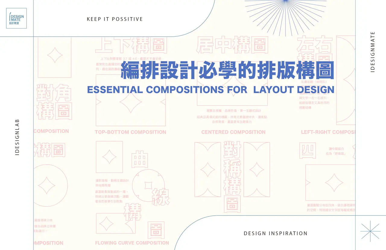
① 上下構圖 Top-Bottom Composition

最常見也最穩定的設計方式。
文字與主體上下分區排列,適合資訊層級明確、需要強調標題或口號的版面。
👉重點:上下比例要掌握 3:7 或 4:6,畫面才不會呆板。
Elements are divided vertically to create balance and clarity.
② 居中構圖 Centered Composition

經典且具儀式感的構圖。
所有元素圍繞中央,讓焦點自然聚集,畫面更有主題張力。
👉 適合: 展覽主視覺、品牌形象、單一主題式設計。
All elements align around the center, creating a sense of unity and formality.
③ 左右構圖 Left-Right Composition

強調對比與平衡。
圖片與文字一左一右排列,能創造穩定又具秩序的視覺結構。
👉 技巧: 左重右輕(或相反)能讓畫面更有動感。
Text and images are placed side by side to emphasize contrast and structure.
④ 對角構圖 Diagonal Composition

讓畫面充滿動態感的構圖。
元素沿對角線分佈,能強化主題張力與方向性。
👉 適合: 動態主題、運動品牌、音樂節等需要節奏的畫面。
Elements follow a diagonal axis, creating motion and tension.
⑤ 對稱構圖 Symmetrical Composition

帶有平衡與莊重感。
對稱並非絕對平均,而是利用視覺軸線達成穩定的重心。
👉 延伸: 可搭配光影或色塊分佈,避免過於死板。
Both sides mirror each other, achieving visual harmony and order.
了解設計課程

⑥ 四角構圖 Four-Corner Composition

畫面重點分佈在四角,讓中間留白成為「呼吸區」。
👉好處:留白讓視線有休息的空間,特別適合文字型海報或概念設計。
Key elements are placed in the corners, leaving negative space in the center.
⑦ 點散構圖 Scattered Points Composition

以小元素分佈構成畫面節奏。
👉 適合: 音樂、科技、青春類主題,能營造自由與流動感。
技巧: 控制密度與大小變化,避免雜亂。
Elements are scattered irregularly to create rhythm and visual energy.
⑧ 包圍式構圖 Surround Composition

主體在中央,文字或圖像環繞分佈。
👉 視覺效果: 強烈的中心聚焦感,非常適合品牌主視覺、LOGO應用或海報焦點展示。
The main subject is in the center, surrounded by supporting elements.
⑨ S 形曲線構圖 S-Curve Composition

最富節奏與動感的一種。視線沿著S型曲線流動,讓觀者自然被導引到焦點。
👉 常見應用: 攝影海報、動態主題設計、時尚類視覺。
The viewer’s eyes follow an S-shaped path, guiding smooth visual flow.
✦ 設計思考 Design Insight
構圖是設計的骨架,創意是靈魂。
你熟練這九種構圖後,不是要被框架限制,而是能更自由地打破規則。 每一次排版,都是一次「視覺語言」的練習。


發表迴響